
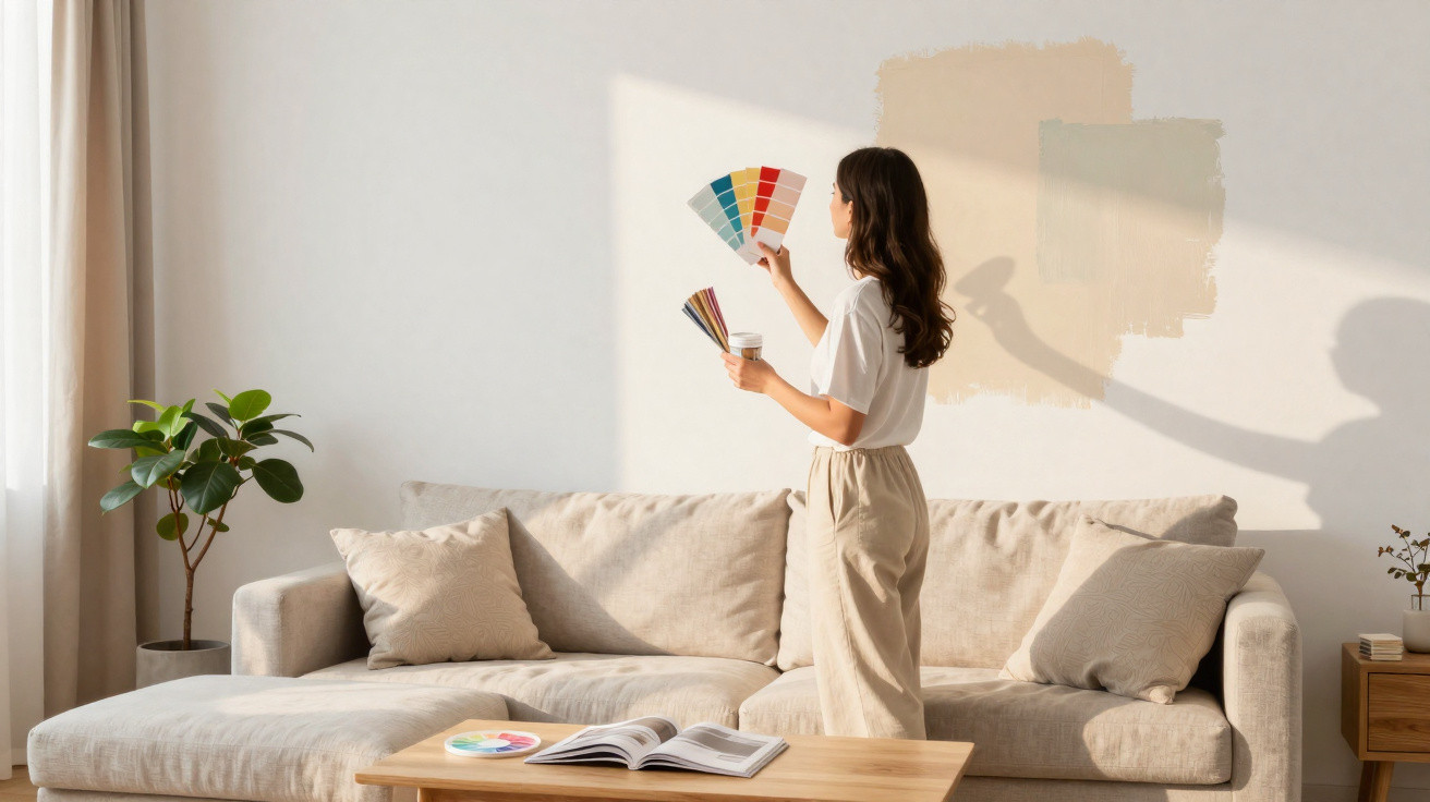
White has long been treated as a wildcard in interior decoration: it brightens rooms, makes them appear larger and works with almost anything. In many renovation schemes, it is the first choice for those seeking simplicity. However, architecture and interior design specialists have been drawing attention to the emotional and practical effects of this decision, particularly at a time when people are spending more time at home.
Why is white still so widely used in interior decoration?
White is commonly linked with cleanliness, order and natural light. In small flats, it is very common to use white on every wall, creating a greater sense of space and making it easier to match furniture and decorative items.
Its “neutral” nature also influences the choice: it provides a backdrop for artwork and decorative pieces, and it is frequently used in properties being sold or let because it is less likely to clash with the preferences of future occupants.
Watch this video from the Doma Arquitetura YouTube channel, which explains why pure white walls may be worth avoiding and which colours can make a home feel more welcoming:
https://www.youtube.com/watch?v=E_tM0f1I1rQ
What are the hidden effects of white on home walls?
Although white walls can create an impression of order, they also make every sign of clutter or wear more visible. Marks, scuffs and dust show up easily, requiring more regular cleaning and more frequent touch-up painting.
From an emotional perspective, too much white can create a feeling of emptiness or coldness, particularly when it is not balanced with wood, fabrics, warm lighting or touches of colour. To better understand this practical and emotional impact, consider some recurring effects:
- It highlights clutter: any item left out of place becomes more noticeable.
- It increases brightness: this can be beneficial in social areas, but tiring in spaces intended for rest.
- It can create a sense of coldness: especially where warm colours, textures and natural elements are lacking.
Which colours can replace white walls without making the room darker?
Those looking for alternatives to white can now choose from many soft shades that retain brightness while adding warmth. Pastels such as pale pink, soft blue and gentle greens can create calm spaces with more personality and less of a clinical feel.
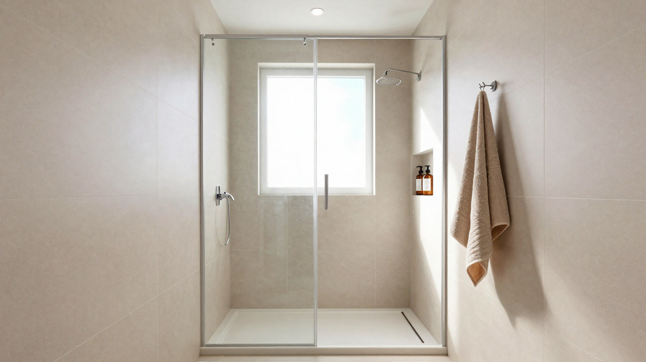
Warm neutrals, including beige, sand, off-white and brownish greys, are also becoming more popular because they retain white’s versatility. In living rooms and bedrooms, they pair well with wood, natural fibres and plants, creating a welcoming atmosphere that feels more human visually.
How can white be used in home decoration in a balanced way?
The discussion is not about giving up white altogether, but about balancing its use according to the day-to-day needs of each room. It remains an important ally, especially on ceilings and doors, as long as it is shared with other colours, textures and natural materials.
A thoughtful combination of light-coloured walls, accents of colour, comfortable fabrics and indirect lighting can preserve the feeling of spaciousness without making a room monotonous or cold. In this way, the home gains in wellbeing, supports sleep, focus and rest, and adapts each space more effectively to how people actually live there.


Comments
No comments yet. Be the first to comment!
Leave a Comment